 I like browsing the grocery store to try things I’ve never tried before. I found this fruit called a kiwi berry. It tastes like a kiwi and has the inside texture of a kiwi, but is the size of a grape with slightly tougher skin, but soft enough you can bite though – not as tough as a banana skin.
I’ve described to you a brand new experience that I had – eating a kiwi berry – but described it in the context of patterns I recognize; the taste of a kiwi, the size of a grape, the skin was softer than a banana.
As designers and project managers, we are not just creating designs but creating an experience. With that in mind, remember that our human psychology is built to recognize patterns and make correlations. By the time you reach your adult life, almost everything you experience is filtered through a previous experience.
What does this mean in a design context:
If someone sends you a text message in all caps, it’s a safe assumption that they’re trying to communicate that they’re yelling. (there are exceptions when you mother-in-law has turned on caps and can’t get them the off again – hypothetically speaking…) Bonus points for extra volume if you tag on an exclamation mark also.
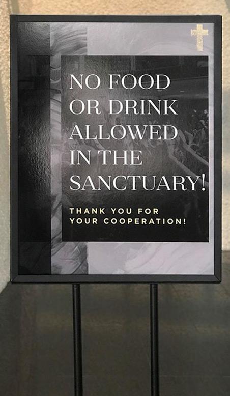 I took a picture of a sign that greeted me when I walked in to visit a church. There’s no value to naming the church, but an opportunity for all of us to learn. (for the record, I asked their permission to post this picture)
For context, there is no other signage in the building. This is the only sign I see when walking in, and there are 4 of these lined up between the entrance to the building and the sanctuary.
They are in a metal frame, 3 feet tall x 2 feet wide.
What could this sign choice communicate?
- Our priority is avoiding coffee stains on our seats. Kids check-in, guest services, and restroom locations didn’t make the cut when we decided what to communicate with signs, but not spilling coffee did.
- WE’RE YELLING: Not only is it important, it also needs to be emphasized. It’s all capitals and ends with an exclamation mark. In most contexts, this is yelling. But Adam, it’s a design style… I get it. Leave out the exclamation mark then and use a softer font than a serif.
- We have this rule. For someone who is apprehensive about coming to church because ‘it’s all rules about what you can’t do,’ you’ve started their experience by reinforcing their apprehension – Not “welcome home” or “we’re glad you’re here” or “here’s what we’re about” but just yelling and emphasizing our rule.
As an alternative to this sign, my recommendation to this church is to have a sign in the cafe area that says “Please finish your beverage before going into the sanctuary.” and have an usher or greeter at the door who can ask anyone walking in with food or beverage to finish it before going into service.
This church is also going to replace these signs with wayfinding signage, pointing guests to restrooms, kids check-in, guest services, and their coffee shop.
Seriously, Adam?
Ok, I can hear you from the other side of my keyboard. Adam, you’re making a mountain out of a molehill.
Remember: You only have one opportunity to make a first impression, and if anything that I’ve said resonates true with a visitor, it’s worth considering.
I’d love to hear your thoughts. Leave a comment so we can all learn together: