
The beautiful thing about churches is that, when run properly, we’re a team of people doing whatever we can to further the Gospel. This often means that people are taking on tasks and helping out in areas beyond their expertise. In order to not become overwhelmed with marketing and graphic design request, different leaders from department heads to small group leaders will often create their own handouts rather than having to run everything through the marketing department.
One of my biggest pet peeves is how logos get used (or should I say misused), so one of the first things that I created when I came on staff at Life Church is our Logo Use Guidelines that we ask everyone to follow when they’re producing any kind of material that includes our logo. Even though we provide the actual file of our logo for those who require it, sometimes it still gets squashed, stretched or modified to ‘fit’ an application.
Think about who will use your logo and the application of how they’ll use your logo. Use terms that a non-designer will understand (ie. letter spacing instead of the word ‘kerning’).
Here’s our policy. We give ours out in a PDF so it can’t be edited, but I’ve put it here in images and text so yo can use whichever pieces best apply to you. To create the examples, I used photoshop and simply used the line tool to draw an ‘x’ through the incorrect examples:
Life Church Logo Use Guidelines:
1) Use the logo in its original proportions, not squashed or stretched. It can be resized as needed to for the design, but the circle icon with the ‘L’ paint stroke should always be a circle, not an oval:
![]()
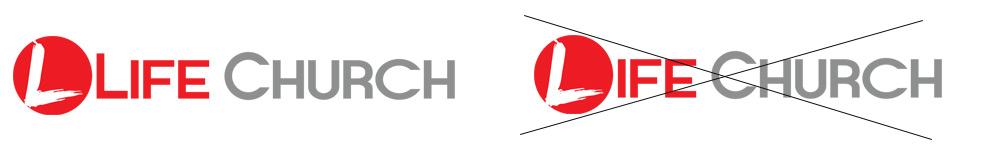
2) The ‘L’ in the circle does not replace the letter ‘L’ in LIFE
3) The circle with the ‘L’ icon (with or without the words “Life Church”) needs to appear on everything that relates to Life Church. This includes mail outs, hand outs, sign up for registration forms for events, posters, etc. If your department has it’s own logo (Youth / Kids / Small Groups / etc.), the Life Church icon still needs to be included in the design (it can be a faded watermark). In some cases where the red conflicts with your design colors, a white icon may be used.
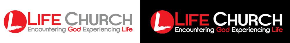
4) The full logo can be used with the red/grey font or on darker backgrounds the red and white combination. In black/white print, it can be solid grey, or on dark or colored background, it may be solid white.
5) The logo appearing in color must appear as red: RGB: 237,28,36 / CMYK: 1,99,97,0 / hex# ED1C24
6) Use the logo as a stand-‐alone image. Don’t use it to replace ‘Life Church’ in a sentence.
7) Use the logo in original resolution, or smaller. Making the logo larger than it’s original resolution can cause pixilation and distortion. If you need a version of the logo larger than you have, please request a full resolution version.