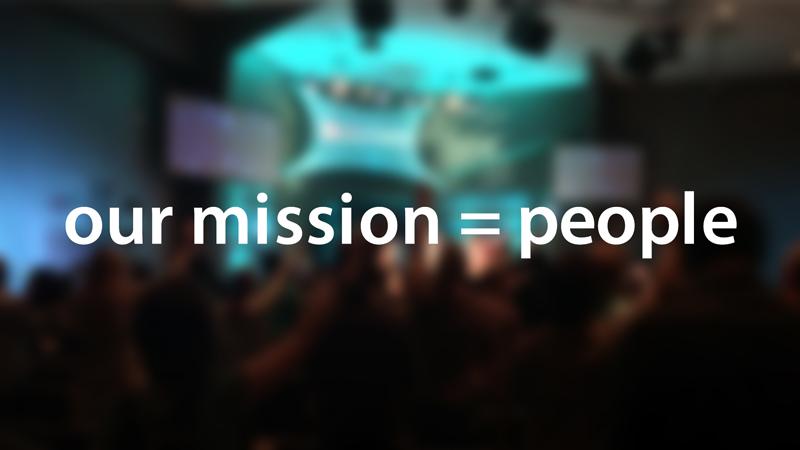
 I like to take quotes from the weekend’s message and use them on Social Media. It’s pretty easy to pull these quotes out if you’re listening to what quotes people respond to or tweet themselves. I have the opportunity to tweet on behalf of Life Church during service, so I’ll use this Images get much more engagement than a text quote, so I like to find images that reference the content of the quote, or an actual image from that person to use with the quote.
More than just including some text on an image, I like to ‘build’ or ‘integrate’ the text with the image and one of my favorite ways to make that connection is to have the subject overlap the text, so it looks like they’re connected.
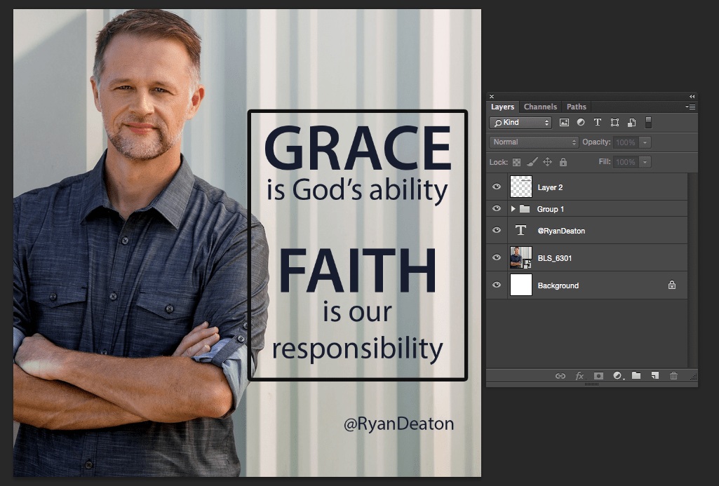
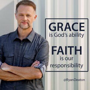
Here’s how I built the image on the right in photoshop.
Before you start, pick your quote and your image. You can change either of these as we go, but it’ll be easier to develop a design if you’re committed to including those concepts.
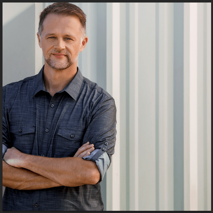
I started with a picture I had on file of Pastor Ryan and decided I wanted to use the image on instagram. Since instagram only allows for square images, I created a new photoshop file 500px by 500px.
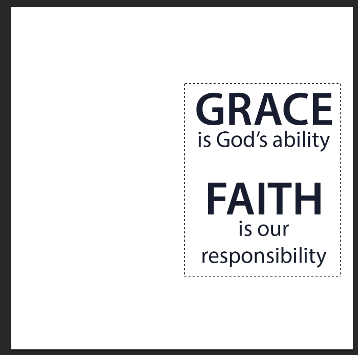
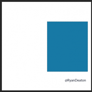
Then I made a text box to decide where I was going to position the quote and made “Grace” and “Faith” larger for emphasis. After the text was in place, to make the outline, I used the rectangle selection tool and made a rectangle around the text:
I filled in the selection on a new layer with a color:
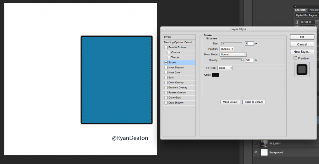
And added a layer style by double clicking the layer in the layer pane. I added a ‘stroke’ in this case 8px / Position: Outside / Blend Mode: Normal / Opacity 100% and the fill color I used was the same as the font:
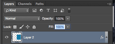
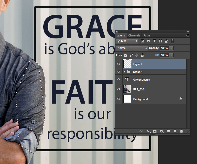
Selecting that layer, I took the fill down to 0% – this leaves the stroke, but removes the bright blue filler I had used.
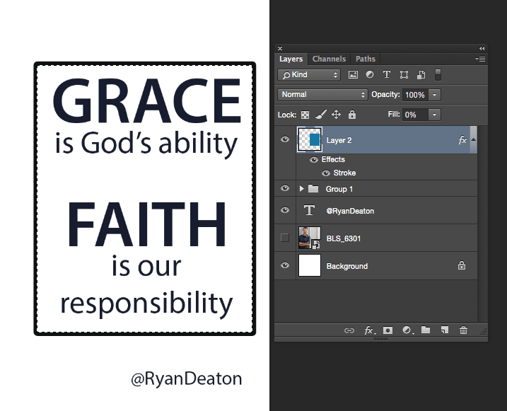
So now the image with the picture layer turned on looks like this:

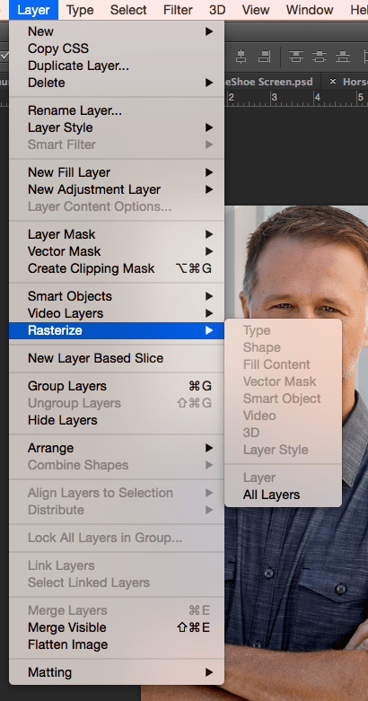
In order to edit a portion of the ‘stroke’ layer, I had to rasterize the stroke layer so it’s editable:
Using the lasso selection tool, I selected the area where the quote box was over Pastor Ryan’s arm:
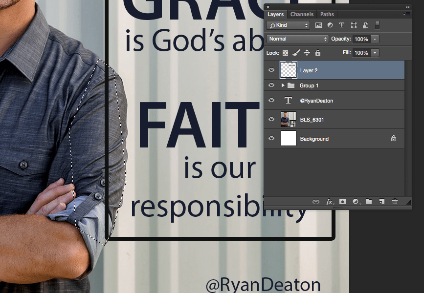
and delete that portion from the rasterized stroke layer. It will then look like the text frame is behind his arm:
You can do this with text as well, not just shapes or lines, but you’ll need to rasterize the text (turn the text into a shape) which means you won’t be able edit the text after it’s rasterized.
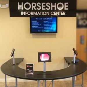 We also have 4 LCDs in the foyer. 2 that duplicate the countdown happening in the auditorium, 1 that’s designated for kids check in, and 1 that’s designated for our Horseshoe information center (we call it the horseshoe because… well, it’s shaped like a horseshoe. Also, during service, when we say “Sign Up At The Horseshoe in the foyer,” just about every new visitor can figure out where that is any why it’s called that.)